
Public Ventures
Web Design for a Toronto-based Venture Capital firm focused on commercializing research in the Healthcare, Biotech and Pharmaceutical sectors.
Problem Statement
Public Ventures is working to accelerate the research of Canada’s leading public sector institutions towards commercialization. There is a significant funding gap preventing many of these innovations from entering the public market, and PV’s is creating a digital tech transfer network to impede the momentum and success of high growth startups.
Project Objectives
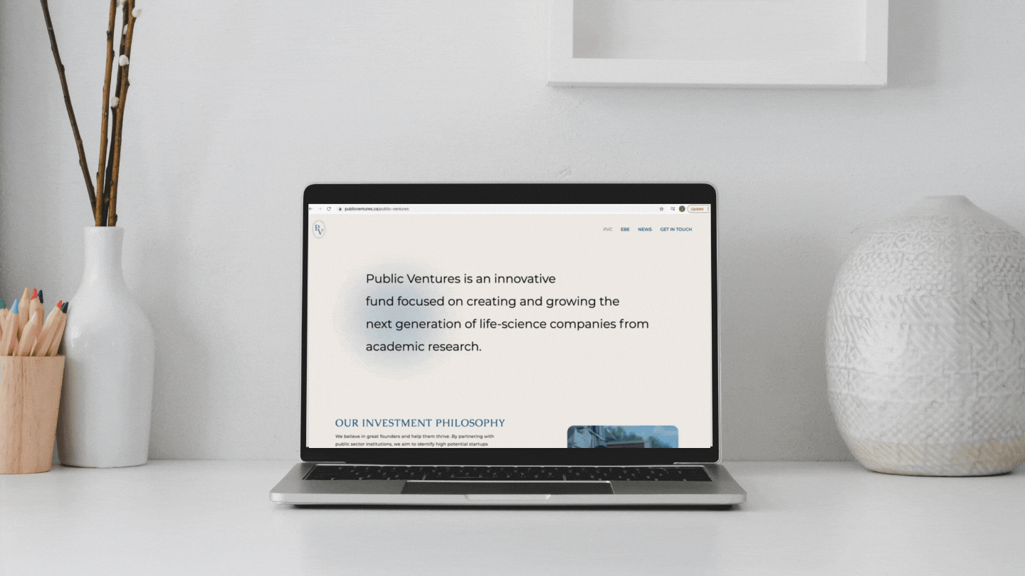
Design a website for Public Ventures that is user-friendly, informative, has a clean design, and is a delight to use
Ensure visitors are able to explore and understand the existing gaps in the market as well as the research journey of these startups
Introduce web and tablet optimization
Scope
Web Design, Brand Strategy
Tools
Figma, Adobe Illustrator, WebFlow
Role
Prototyping, UX + UI Design
Team
Worked with a team of 3 amazing women
Duration
Sept 2020 Oct 2021 - (from ideation to release)

A lot of research went into the design of this site, from developing a thorough understanding of the current university research commercialization landscape in Canada, to shaping the design around the goals of the researchers, donors, supporters, and entrepreneurs that would be using the website.
Although a lot of process and research is confidential in nature, our team did conduct extensive outreach, internal data visualizations, landscape mapping, and references prior to designing the website.
The Process
I began with some initial research on the structure and design of other Venture Capital websites. Some takeaways of what made them successful included:
well structured navigation
informative, actionable data
simple design with a defined visual hierarchy
Then, I brainstormed some “how might we” questions to help better align the tasks and goals of our users.
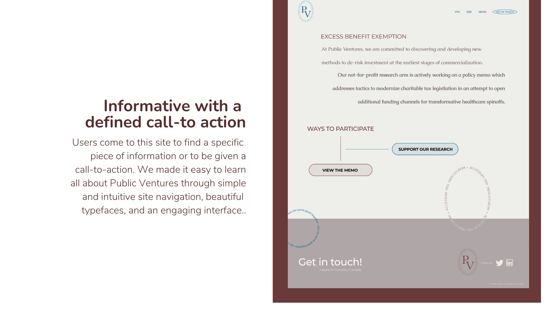
How might we design a web experience that is not only engaging & valuable to our users, but also a delight to use?
How might we ensure they access and read the most critical information about Public Ventures while on the site?
How might we ensure that they leave with a call-to-action (contact page, etc)?
Research Methods
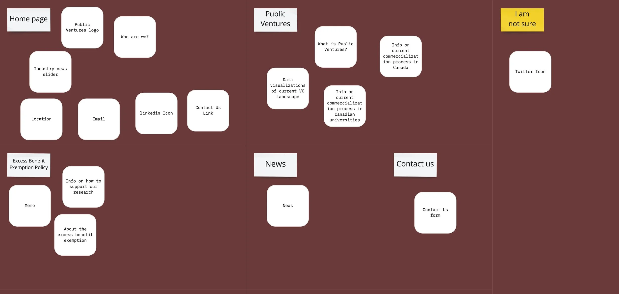
01 — Card Sorting
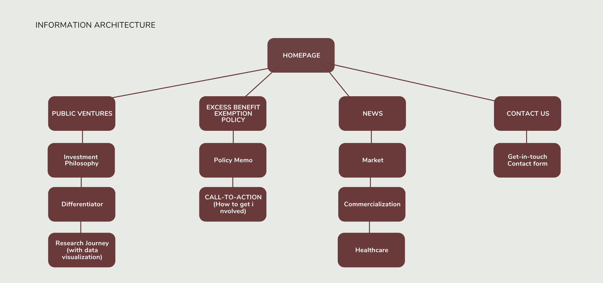
VC websites need to be informative. We needed the website to be easy to navigate, so organizing the information in a way that ensures users will find what they’re looking for is essential. We chose closed card sorting to figure out an organization scheme that best matches users’ mental model. I love using this research method because it allows the team to determine which functionalities should stay, be relocated, or eliminated based on how much value it is adding to the websites information architecture.
02 — Internal Feedback
We also asked for feedback from those who were knowledgable about either design or venture capital within our networks. The questions asked were specific around what should be added or removed from our current list of features and information. The purpose of this was to discover potential quick wins on improvements that would allow for a better user navigation on the site.
“You want to create a site that helps tell your story — highlight why you exist, what you do, and why it matters. Simple imagery and direct language are the smartest routes to take for VC sites” — Peer feedback.
Key Insights
Include all important information about who the firm is and what they do on the first page — if users are not informed immediately after landing on the site, they will become uninterested
An Industry News page would be helpful. It demonstrates knowledge about the current VC landscape and adds credibility to the site
A custom carousel with a time slider to cycle through featured investments should be featured on the first page
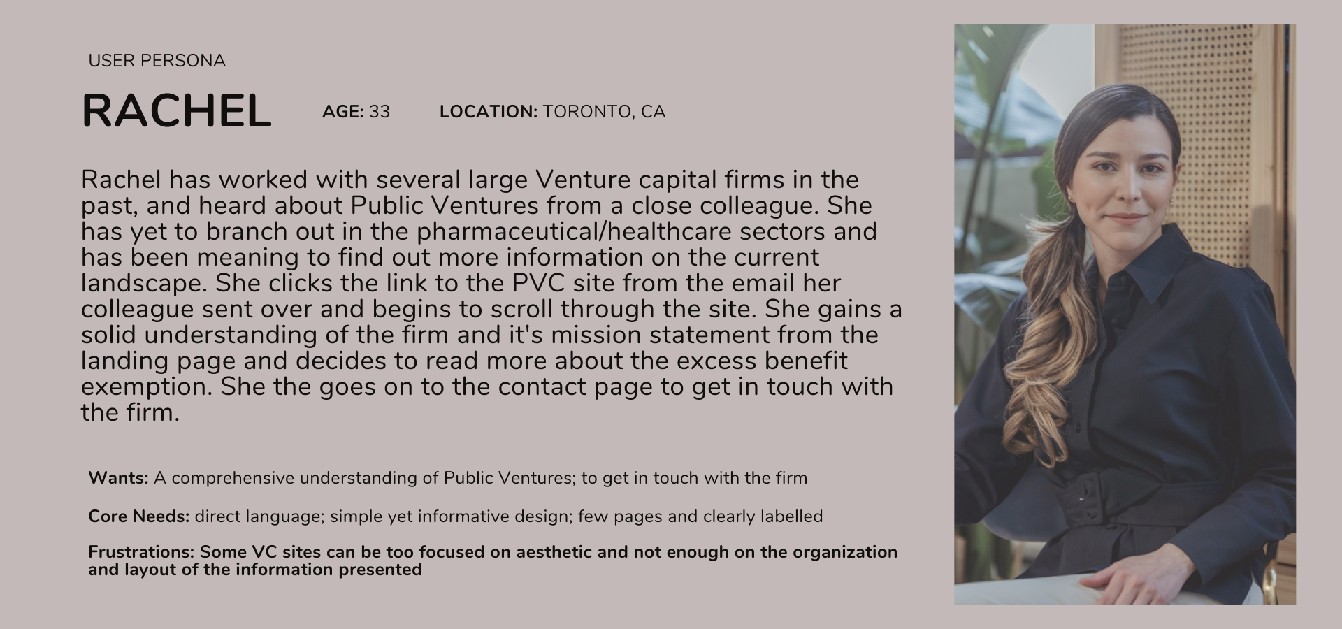
After my initial research, I always find it useful to narrow down the insights even more. I did so by developing two personas of possible users and how they might navigate the website:

Problem/Opportunity Spaces
How am I going to address the problem spaces in my designs?
Problem Space 1: Venture Capital Websites are often overloaded with information, making it difficult for users to quickly find what they are looking for.
Will introduce focused content strategy and copy direction to better communicate their unique value proposition, with a custom carousel with a time slider to cycle through featured investments on the homepage.
Problem Space 2: It can be challenging for new firms to establish their presence in the space, highlight their unique approach, and feature prominent investments through a website.
Will ensure branding is clean and powerful while utilizing features such as custom animations to add a dynamic element to the site
Problem Space 3: Student entrepreneurs and professionals will both be using the website. The site design needs to be considerate of both mental models.
Will introduce seamless navigation for all users, giving them confidence in where they are and what they can receive from our website
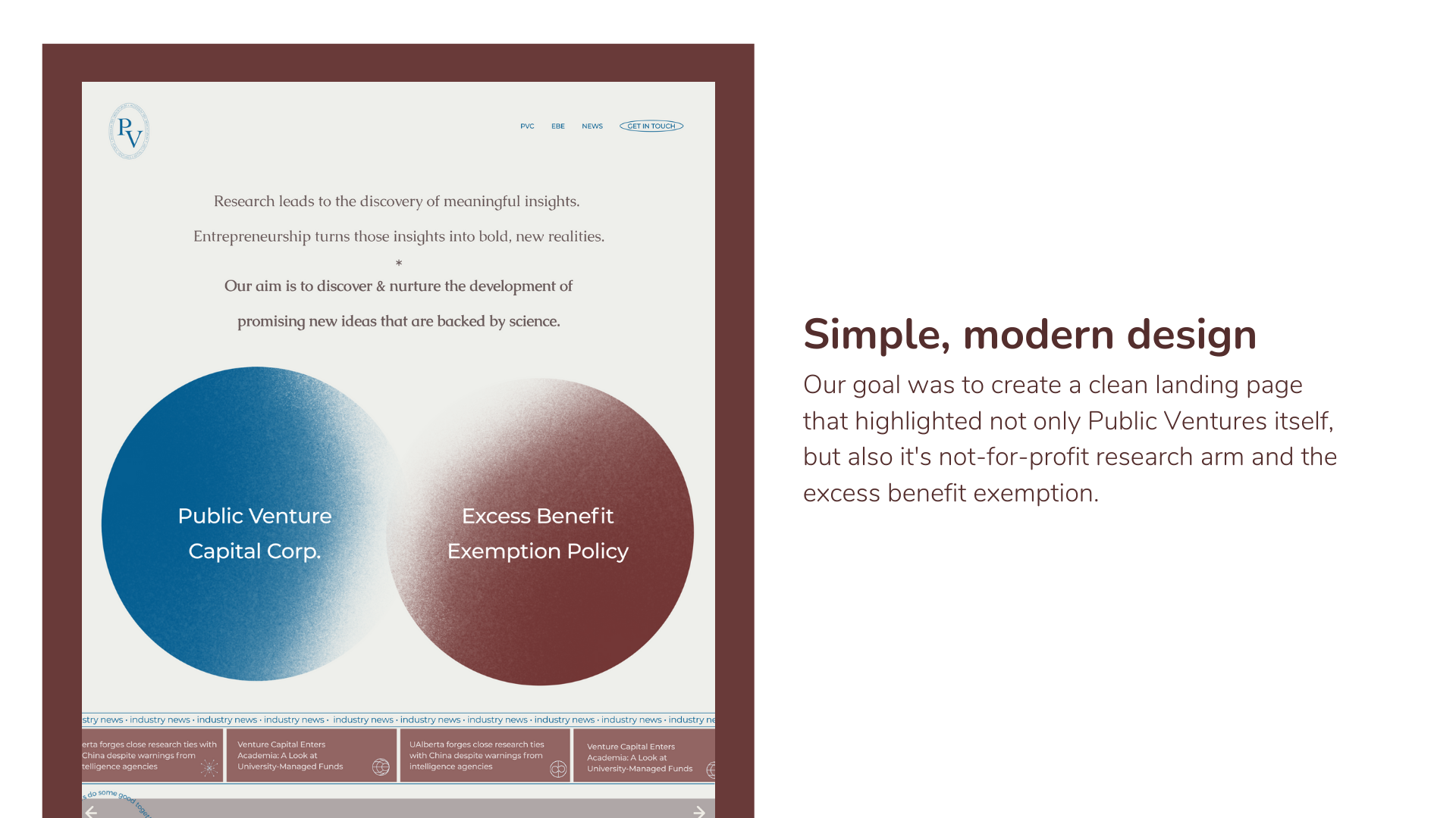
The Solution
Design a website for Public Ventures that is user-friendly, informative, has a clean design, and is a delight to use. Both students and professionals alike will be visiting the site, so ensuring that the information for both demographics is not only included but effortlessly accessible is necessary.
Low-fi wireframes:

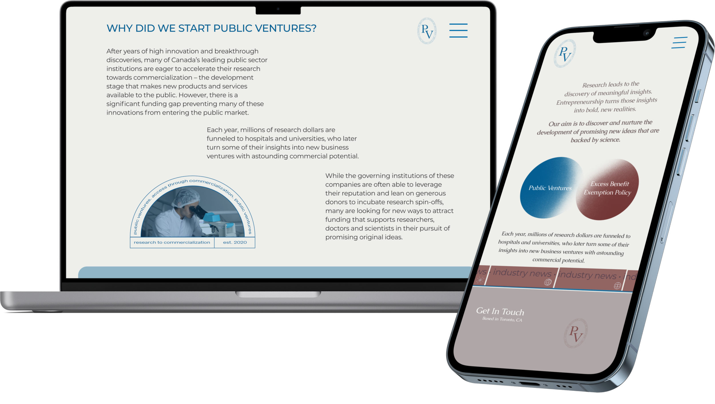
Final Designs:
Key Takeaways
I had such a great time working with my team to conduct the research and design the interface for this project. Not only did it allow me to gain an extensive amount of knowledge about the current research and commercialization landscapes within Canadian universities, but was also an opportunity to problem solve and open my eyes to different and completely new ways of thinking. Here are a few of my takeaways:
Be passionate about making things work.
I celebrate my willingness to creative problem solve and embrace every challenge that comes my way. When I am unsure of things, I ask questions and search for answers so I can get as much clarification as I can. When building out this site it was my first time using Webflow. I was excited for the complete design freedom but I did hit quite a few roadblocks along the way. I watched countless Youtube tutorials, reached out to some design friends, and troubleshooted…a lot. In the end, it was worth it and I made it a priority to ensure I was learning and enjoying the process on the way to the final result.Have a (really) good understanding of the current landscape.
Doing extensive research into the current VC and commercialization landscapes in Canada, as well as the gap between products being developed in universities and them reaching commercialization proved to be extremely helpful when we began working on the actual design. I was able to empathize with the potential users because I understood exactly where they currently find themselves, and what their goals would be when using our website. Combining this knowledge with other valuable UX research methods including card sorting, interviews, task analysis, and personas proved to be very useful.Manage time efficiently and plan design process accordingly.
This entire project was done remotely due to COVID-19, but having weekly team meetings and daily check-ins really allowed for as seamless of a process as possible. We were able to work independently and then meet to discuss findings, bounce possible ideas off of each other, and gain valuable feedback. Setting deadlines for myself, especially in projects that are more self-guided helps me to ensure that I stay on track and meet my deliverables on and even before deadlines. This gives me more time to review and iterate throughout the design thinking process.
What’s Next?
I think it would be beneficial to set up some click and scroll heatmaps on the website and compile a visual report of where and how actual users are navigating the site. This would help us to gauge what users really care about cross reference these findings with our research. We can ensure that our calls to action are being clicked on and brainstorm ways to improve the user’s interaction(s) with the interface.